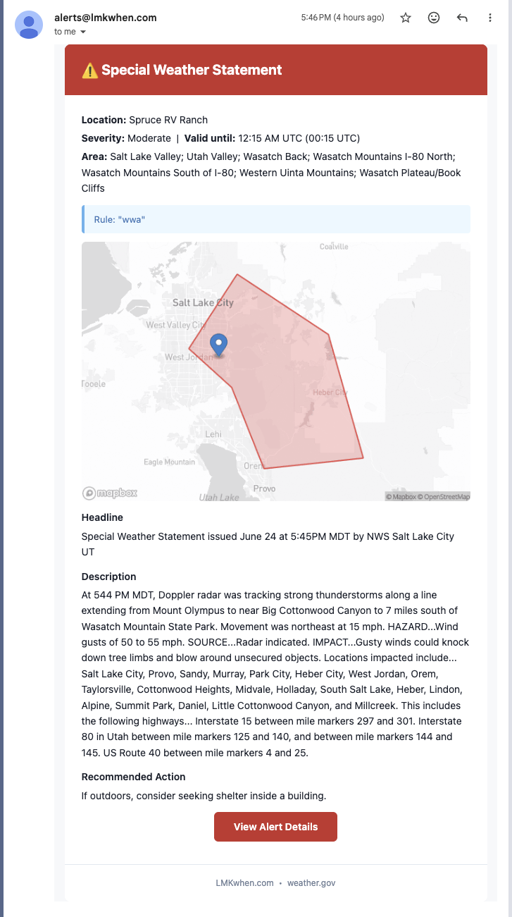
See exactly where the weather is — maps in your alerts
Every alert now comes with a map. Your email and Slack notifications show the hazard area — the warning polygon or the forecast outlook — with a pin on the exact property it affects, so you can tell at a glance whether the threat is right over your location or just nearby.
For Storm Prediction Center outlooks the map draws the full risk picture: each category — Marginal, Slight, Enhanced, and up — in its own color, with the band over your location highlighted, so a "Slight Risk" alert actually looks like the day's outlook instead of a single shape. And when you tap the link in a text message it now unfurls as a rich preview on your phone — the map and a one-line summary — before you even open it.